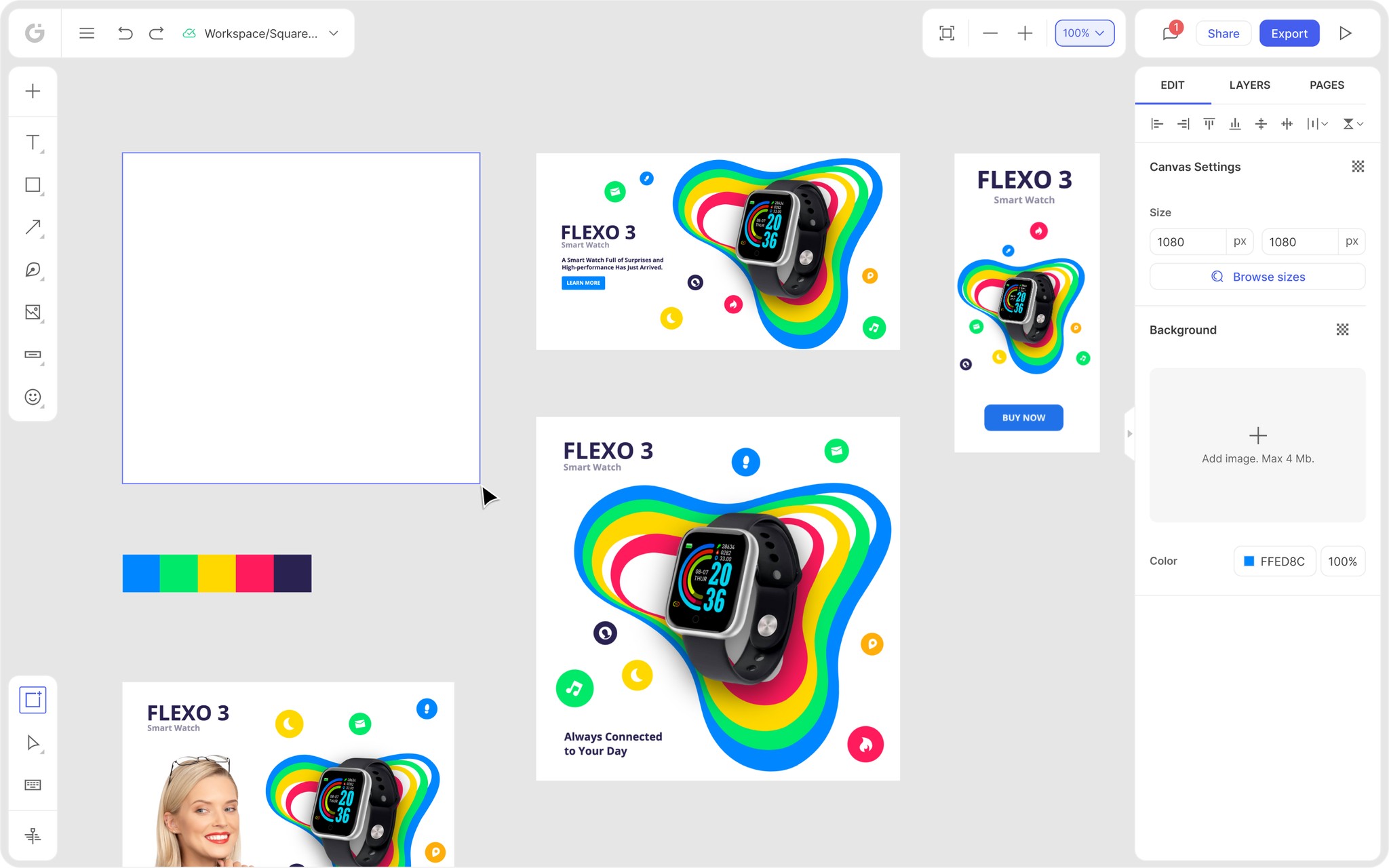
The Shopify Hero Banner is a design format used to create visually striking and attention-grabbing banners on Shopify websites.
Posted Jan 25, 2023
•
7 min read

Design, Graphic Design, Marketing

Create beautiful marketing graphics at scale.
Top 8 Logo Design Trends of 2023
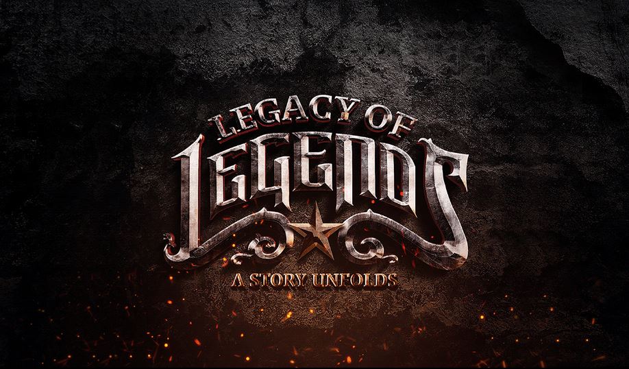
The logo design trends of 2023 do continue to build itself. For now, though, here is a list of eight most trending logos of 2023:
1. Logos with 3D gradients
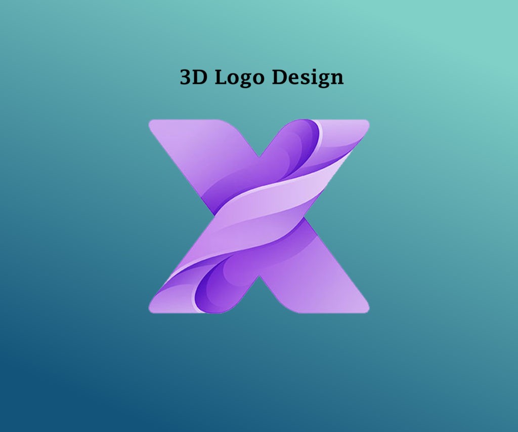
This trend perfectly fits our smartphone society and is seen as the most popular gradient trend that has evolved with its 3D touch. This is a very innovative way that helps turn any color into a spectrum of a vibrant and unique cauldron that’s full of energy and life. In 2023, designers looked up to working on an evolution of creating deep gradients and logos with 3D effects. The need to tap into the emphasis on a central point and lively contrast with the colors has also been addressed, bringing about the evolution in the logo design trends of 2023.
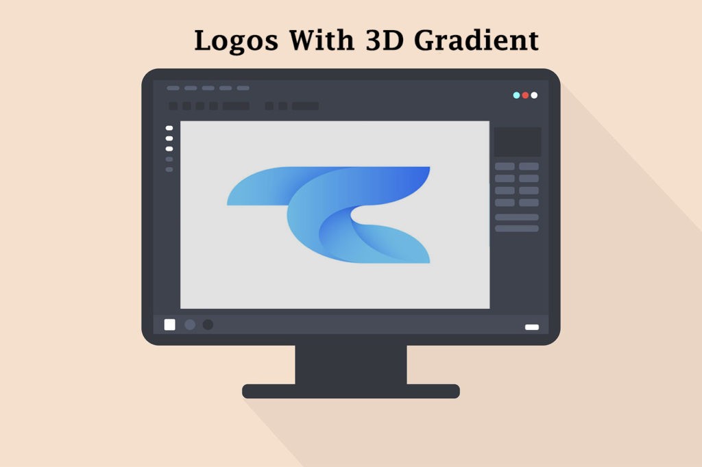
Although the printing of 3D could be tough, they look great on the virtual end which is why they are seen as the most trending logos of 2023. Let’s gear up to witness the designers work to their full potential on gradients with captivating 3D effects and shadows that were not seen before!
2. 2023 Graphic Design logo Trends with 80s throwback designs
As a known fact, the 80s seems to be an era long past along with its cool features. But, having said that, the designers played with the retro beautifully; clashing them with the energetic 2023, hinting at the resurgence of the vibrant neon, chrome, and pixels.
The best way to captivate consumers with this theme is through nostalgia that brings along its retro nature making it cool and collectible. We have people go on repeats with the ‘F.R.I.E.N.D.S’ series, building on cassettes, despite us coming a long way up since FRIENDS was first aired. And let’s not even forget the vintage arcade cabinets in our living rooms, and now, the logo to add to the retro fun.
3. The imperfectly perfect and eaw logos design trends
Keeping in mind the perfectly proportionate logos, we have proudly hand-drawn logo sets to hit the trend of 2023 logos celebrating “wabi-sabi” that comes with writing and drawing. The imperfectly perfect logos take us back a different route of sketchbook asymmetry times with shading techniques, uneven lines, contour shading, and cross-hatching.
We have all come across logos that hint at its imperfect nature that makes it even more relatable and natural on its own. In 2023, the designers got grittier and came up with sketch-stamp-like logos, hinting at the homegrown, organic look. These logos help brands show their authenticity and personality that helps connect with their customers even more.
4. Ultra thin-lined logos design trends of 2023
2021 could also be called the times of extremely delicate lines. We had designers push into the works of digital media and of designing logos while highlighting the authenticity of delicate and extremely personalized logos. This form of new style needs reproducibility and exclusivity which makes the logo perfect for printing.
They are abstract, sleek, and can’t be pulled off without a computer which makes it popular amongst the industrial and tech industries. Inhibiting the future of tech and speaking of the mysterious, possibilities awaited in the future!
5. Logo design trends inclusive of the vintage cartoon logos of the 1930s
Alongside the nostalgic 80s trend, we had the trends of the logo in 2023 hinting the 1930s with a completely different style. This style brings comfort to vintage cartoon prints amongst the other digitized ones. It is an extremely adorable, simple, and expressive style of the 1930s that hits the spot, appealing to designers and brands alike.
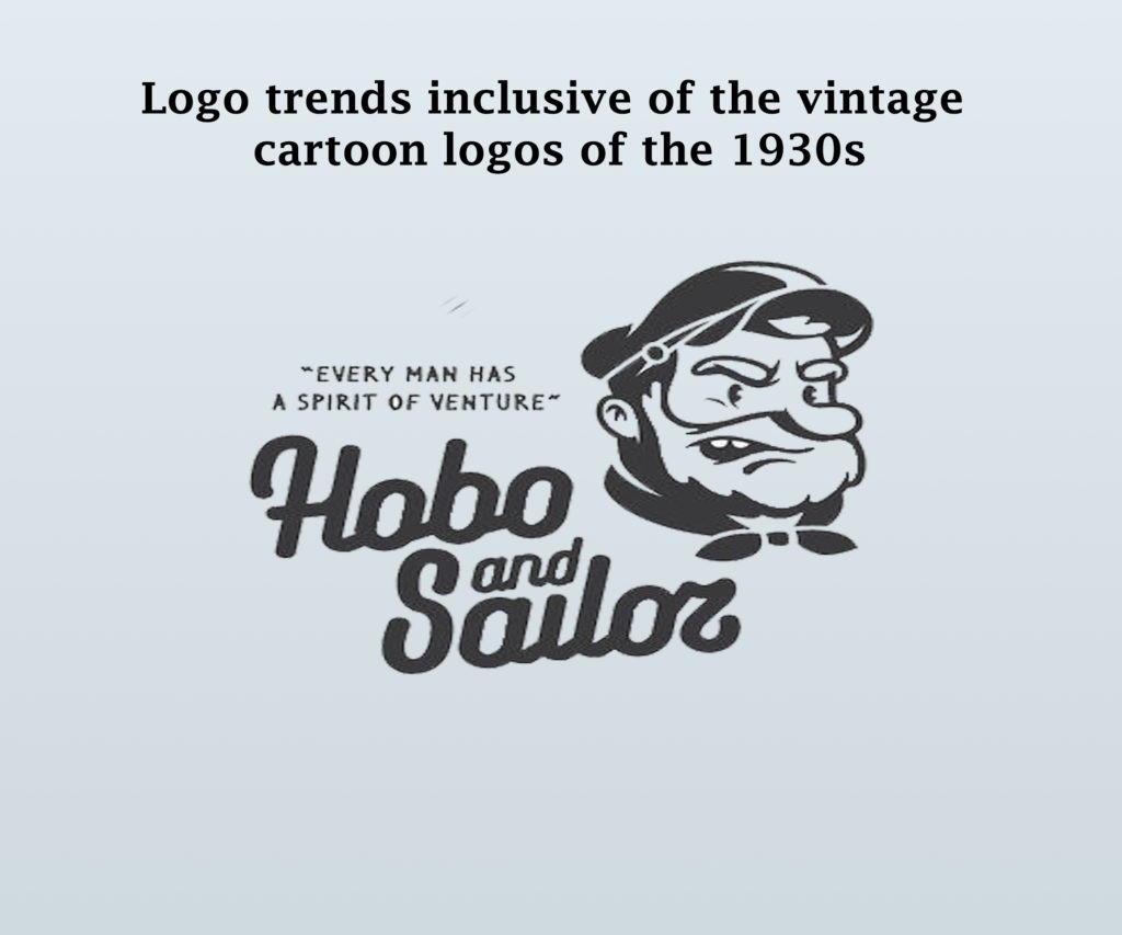
In 2023, be ready to expect more of the vintage-inspired cartoon logo designs and custom-illustrated designs that connect with viewers on an emotionally deeper level.
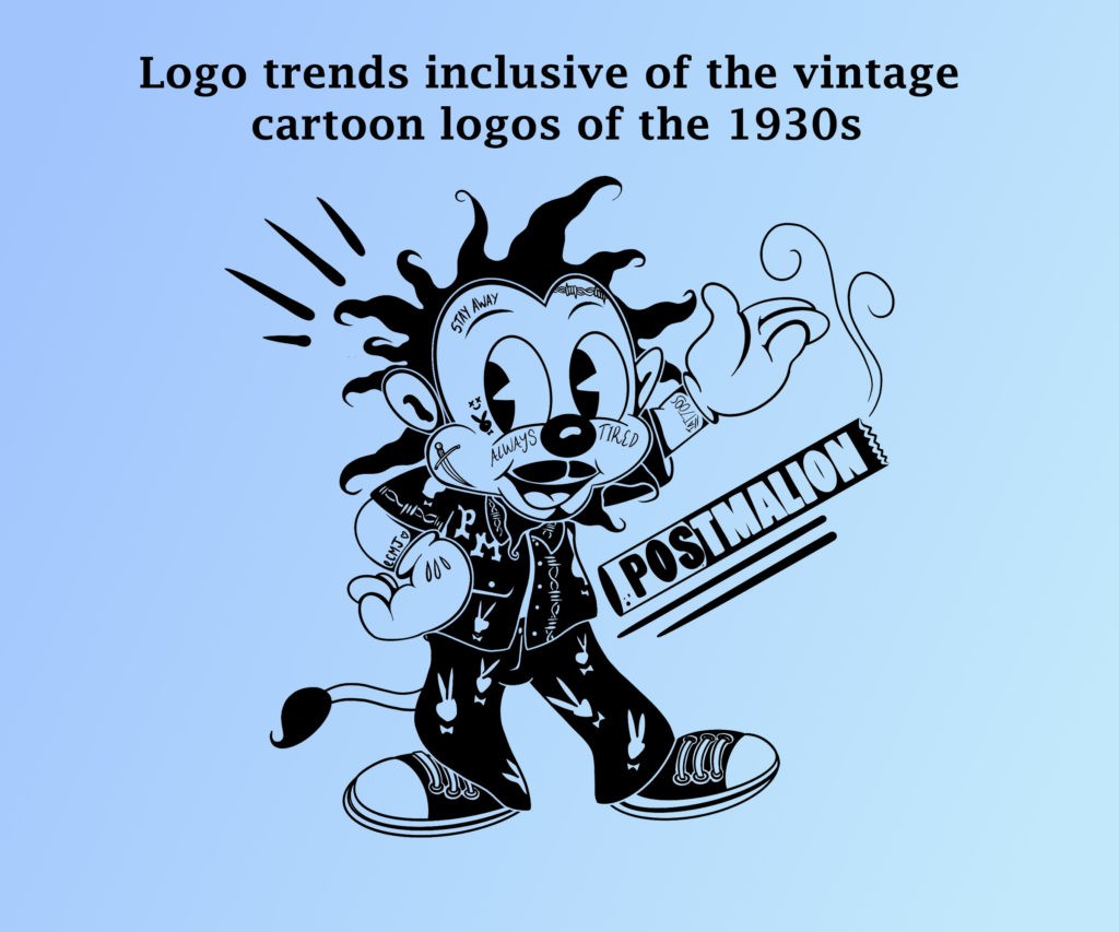
6. Graphic Logos Design Trends that are overlapping and multi-layered
With layers over colorful layers, the logos of 2023 pushed the flat and semi-flat design long back in the past. However, the color and shapes continued, albeit with a touch of playful multilayers of highlights, overlapping colors, and shadows for communication.
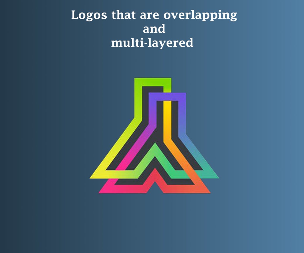
For example, look at the Oshen logo by Arthean. It consists of multiple small circles that are off-center in a larger circle. Shading and layering turn these circles wavey. Three-dimensional effects are caused by overlapping and shadowing elements that create a tactile experience wanting you to touch each layer individually. Subtle effects are also created using semi-transparent layers.
7. Logos Design Trends of 2023 with elaborate details and complex animation
Animation is not new to the market but designers in 2023 really focused on blending in the 2D and 3D animations. We saw some complex designs that had multiple moving parts which made it even more interesting, and different with regards to the traditionally animated logos, which were rather simple and worked to the point.
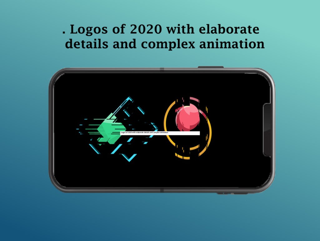
This year designers pushed ahead and worked the details with elaborate animations that connected with the viewers.
8. Complex, daring typography logo design trends of 2023
Some logos elevated their texts from just words with supporting images to the focal point itself. These logos were funky, daring, and had personalities as vivid as the brands in their fonts to represent.
Personalized, driven typography is termed as “weird” by Goopanic; but we think is rather funky and daring, more like typography that has a mind of its own. Designers created typefaces that were extraordinarily different from the regular fonts we otherwise come across daily.
Typography has a lot of ways to play around, like distressing, inverting, or mirroring; which essentially means scattering the letters and not leaving them readable linearly. The most exciting part about this style is that there isn’t one “right” way to do a font logo.
So, are you now ready for the upcoming logo design trends of 2023?
Having seen the evolution of the design industry as a whole in 2023, we further can’t wait for them to be used and reimagined in 2023 and the future beyond!
Logo Design Trends FAQs
1) What makes a good logo?
A good logo is one that talks of the brand itself. It must incorporate hints of what the brand holds; natural, complex, simple, or cartoonist. You can add on to the technicals like – layering, thin line, shadowing, etc based on the origin of the brand that makes it individualistic a unique
2) What makes a perfect logo in 2023?
A good logo is a combination of practical, graphic, distinctive form conveying of the brand or the owner. The logo must work on their concept and execution.
3) Is cartoon style design too childish for logos?
As per the requirement, logos bring up their own stories. Cartoonist designs are one of the topmost styles that are trending logos in 2023.
Features
Explore templates
Alternatives
© 2024 Glorify App - All rights reserved


