
The Shopify Hero Banner is a design format used to create visually striking and attention-grabbing banners on Shopify websites.
Posted Apr 9, 2022
•
9 min read

Glorify Team
Design, Graphic design, Entertainment

Create beautiful marketing graphics at scale.
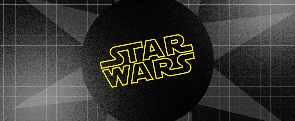
Star Wars Logos: The Evolution Of A Film Icon
Over the last four decades, the Star Wars film series has progressed in line with the period. In the 1970s, what was used as the original star wars logo obviously does not fit in anymore. Pick up some snacks, sense the momentum going into you, and look closely at the evolution of these all-embracing Star War logos throughout the years. For a long time, we all looked at these, but we still have a lot to remember.

Glorify brings you a hand-picked list of all Star Wars logos till now. Have a look and experience the feeling of nostalgia and excitement at the same time.
Star Wars Logo Evolution: The original trilogy Star Wars logos
Star wars logo: Star Wars (NOT A New Hope!)
You may not know that the initial name for the first movie Star Wars is Star Wars if you’re still not older enough to recall the late seventies. In reality, when the movie was in the production stage, the earliest star wars logo had used the title The Star Wars.
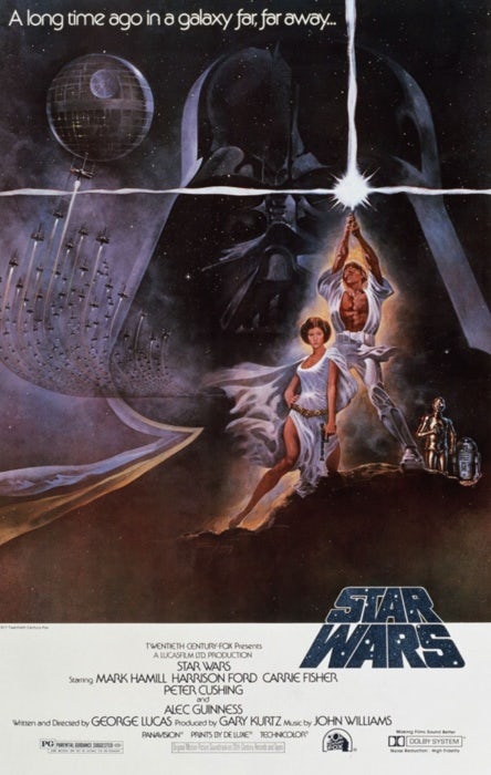
As the movie began production, Ralph McQuarrie’s conceptual artist squad created numerous star wars logos before one was created by typographer Dan Perri. Bold and vivid, the yellow star wars font. This isn’t just “science fiction,” which is so much more imaginative than hard science fiction. Possibly that is why they proceeded in the banner with the star overlay.
The cone-top of the original star wars logo evokes the iconic opening crawl of the film, which was completely unknown to audiences in 1977. Perri was influenced by the 1939 film Union Pacific’s opening accreditations. The main titles looked through the tracks as they moved along the tracks towards everyone as if there were a train.
The “pulpy” look is evoked by his style and it’s really appealing. This was the first poster edition of the film, but it never entered the final movie. Suzy Rice’s original title star wars logo (with a few minor changes from Joe Johnston) starred in the movie.
Suzy Rice’s original title logo (with a few minor changes from Joe Johnston) starred in the movie.

George Lucas demanded his new “fascist” emblem and Rice had just researched German signs from the 1930s, interestingly. She used the methods of design – a bold uniform font, rough lines, and coarse graphs – to create what has become one of the biggest omnipresent logos in the universe.
But the texture of this classic style is just scratched. Rice’s detailed report on all design decisions taken on the Star Wars logo was created.
Star Wars Logo: The Empire Strikes Back
The Empire Strikes Back was among the highly awaited sequences in cinematic history though Star Wars is a film that no one wanted to produce.
The film evolved like other artistic attempts.
The title was modified.
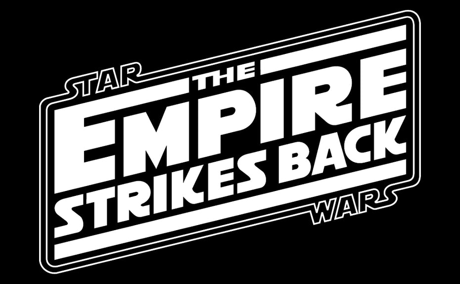
STAR WARS: EPISODE II — THE EMPIRE STRIKES BACK, but some difficulties were met.
The studio marketing unit chose to skip the labeling on the poster and star wars logo itself, while the opening movie used the tag “Episode V: The Empire Strike Back.” The Empire Strikes Back symbol does not adopt a heavy, fascist look, leaving the original star wars logo. The angled text gives it a sense of acceleration and excitement, while the simple angles and the strong letters are in line with the scientific design of the period. The word ‘Empire’ has the biggest room to make sure you know the movie.

The first real Star Wars logo could be considered. The ground-breaking concept of Suzy Rice from the first film is integrated into the border of this star wars logo. The splashes are bundled in an elegant, sleek box.
Star Wars Logo: Return of the Jedi
As the Empire did before it, the Jedi’s return has undergone several changes including the title.
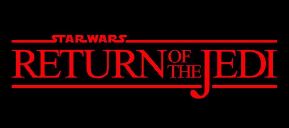
To be frank, at the first glance, the design of this star wars logo looks like something in Microsoft Word. Nothing is vivid about the font. The creators changed the paint slightly, which gives rise to a sinister feeling, from yellow to red. It’s very ironic because Empire is the grim, foretaste film of the trilogy and Jedi ends with a teddy bear battle.
In comparison to Empire, the text of the “Star Wars” in this star wars logo was not inserted into the boundaries. It just sits there and the last S floats completely detached in a vacuum. After two great star wars logos, the whole series is a regrettable way to end the trilogy.

Star Wars Logo: The prequel trilogy logos
The producers had no real idea whether they were to make three or six and nine or even just the one when the original Star Wars was being put into action.
On the initial star wars logo of the trilogy, one thing we must note: they all concentrate on the film’s title. This is typically the subject of any logo in a movie. After all, when you go to the box office to buy a ticket, you want the viewers to know the film’s name.

On the initial logos of the trilogy, one thing we must note: they all concentrate on the film’s title. This is typically the subject of any logo on a movie. After all, when you go to the box office to buy a ticket, you want the viewers to know the film’s name.
One significant difficulty with the new trilogy was to explain what a prequel was like. The Phantom Menace was not the first reference in history, but the idea wasn’t well known to a new audience.
To inform them, these Star Wars logos position their focus on the episode number, for the very first time.

The largest part of the star wars logo is loaded with the massive “EPISODE I” text, while “Star Wars” is strategically located in the upper left, where it will be seen by most English viewers. The official title is the last element of the structure, concealed from the bottom in a tiny shape. The public today calls ‘Episode I’ rather than ‘The Phantom Menace.’
The star wars logo style is identical to the prequels, contrasting with the original trilogy. The star wars font, color, and lock-up are the same, providing a strong visual unity
Star Wars Logo: The sequel trilogy logos
Naturally, the new direction prequels took for the show didn’t satisfy many fans. When Disney purchased Lucasfilm, they realized that a transition had to be made (for more than $4 billion!).

The task for the next era of cinematographer was to convince people why they first enjoyed Star Wars. So, the sequel trilogy star wars logo highlights the original logo more effectively. The title is de-enhanced, like the prequel trilogy; unlike prequels, numbers are not even listed.

In another significant way, they differ significantly from the prequels: color. Green is the light side of the strength; red is the opposite.
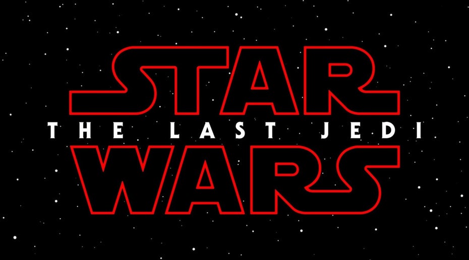
Force Awakens has begun a new century, while the Last Jedi sounds darker and more tragic. The style is uniform, but the tone gives you a sense of what kind of film you watch.
The Star Wars compilation films are relatively new, but we can still see that their star wars logos are not noticeably unified. Return of the Jedi, the only motivating aspect of the original Star Wars logo, is the boxed form of the Rogue One Logo. Skinny, serif font looks like a business letterhead rather than an epic space adventure. At least “A Star Wars Novel” has been integrated in a way that feels consistent with the whole.

The Star Wars Story brand, just like the prequels’ star wars logo design, seemed to be here, and soon, we will be stuck with it. But then Lucasfilm launched Solo’s new logo, bringing things into a fully ancient direction. The new star wars logo has emerged from nowhere totally. The bright yellow fits the original Star Wars movie and the strong tendency reverberates to Empire Strikes Back, which has the most Han Solo ever been seen.
Although others would consider it to be the retreat, we feel it is a good way to look at what succeeds. A New Hope and Empire Strike Back incorporating elements of logos show you the film is going to do the same thing.

Thoughts to complete –
We hope that you find the article enough interesting and informative to share it with fans of Star Wars. And what’s your Star Wars favorite logo? Let us know in the comment section below.
Well, what’s your Star Wars favorite logo. Let us know in the comment section below.
Star Wars Logos evolution FAQs
1) Who founded Star Wars?
Space opera franchise epic science fiction. Star Wars is a media series developed by George Lucas for an epic American space opera. The series started with the same name film from 1977 and soon became a global sensation in youth culture.
2) What’s the sign of Star Wars?
The Star Wars Resistance star wars logo, one of the best-known emblems of Star Wars can also be referred to as the Alliance Starbird, the Alliance crest, and other names. There is a clear explanation that one emblem has more than one name: two organizations have used it.
3) What was the motivating feature of Star Wars?
According to some historians, a graffiti from a Mandalorian weapons expert and artist Sabine Wren in Star Wars Rebels may have inspired the embellishment. The graffiti of the original depicted the mythical phoenix bird.


Features
Explore templates
Alternatives


© 2024 Glorify App - All rights reserved