

Discover the essence of Amazon Storefront banners and their pivotal role in captivating potential customers. Learn the optimal size – 3000 pixels wide by 600 pixels tall – for seamless integration and stunning visual impact. Uncover expert tips for crafting compelling banners that reflect your brand identity and drive sales
Posted Nov 9, 2022
•
7 min read

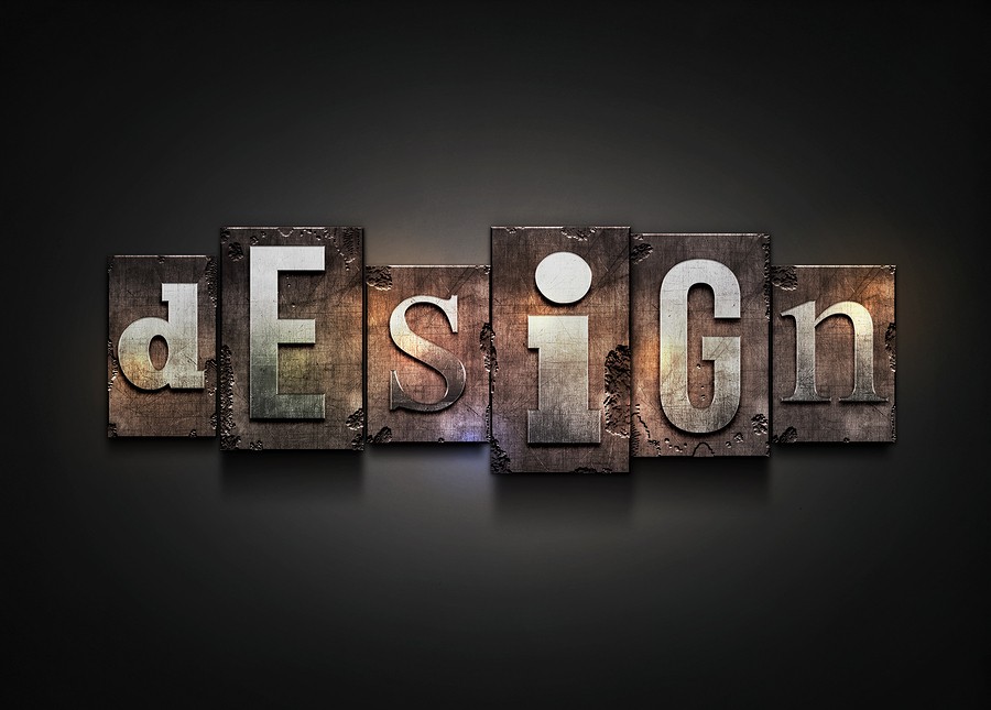
Design, Graphic design

Create beautiful marketing graphics at scale.
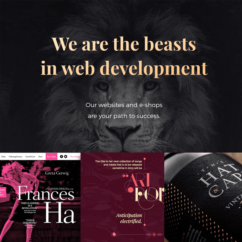
How to select website fonts and typefaces? The best professional fonts for website
Some popular website font styles express various symbolic meanings that should perfectly fit with your marketing messages. It’s also important to make sure that they are readable and understandable, user-friendly, and internet stable when selecting a skilled font for your website – ensuring they function on all screens and platforms. Regardless of whether you are building an industrial or educational website, an online company, or a digital directory, paying due attention to your choice of fonts can really change the game.
Glorify has curated the top 16 professional fonts for a website that cannot be missed in 2021!
1. Playfair Display
This sleek, glamorous and modern website font is the ideal choice for sites with an audience of women. It comes in a variety of weights, ranging from italic to bold, but its artistic character is mostly used in low weight in headers.
2. Arvo
Arvo,one of the best fonts for your website in 2021, is known for its flexibility, user experience, and graphical san-serif typeface. The product comes in four different cuts, standard, italic, bold and bold italics, and can look either traditional or trendy based on the one you select. For this purpose, it can be an outstanding preference for companies across most business sectors.
3. Dosis
The future-proof, nearly sci-fi quality of this sans-serif font makes it an excellent choice for creative science and technology enterprises. It typically fits fonts like Exo and Lato, which have a visual appeal similar to that.
4. Merriweather
Specifically built for windows, even in small sizes, this serif font can be easily understood, making it a particularly good font for websites. It retains an elegant feeling for brands that are taking themselves very seriously if it is in standard, bold, and italic size.
5. Helvetica
Thanks to its versatility, Helvetica is one of the most popular website fonts in the world – with over 100 ready-to-use variants! It was also one of the oldest, since 1957. Nevertheless, its success can be related to its standard, contemporary charm, although it’s rather a traditional typeface.
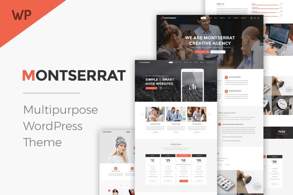
6. Montserrat
This geometrical font, no matter whether it is in the header or smaller text, can be utilized nearly anywhere inside your website, making it the safest website fonts out there. With a fierce and young look, this is a wonderful choice for a millennium population, which is why multimedia and innovative agencies also find it a very useful choice.
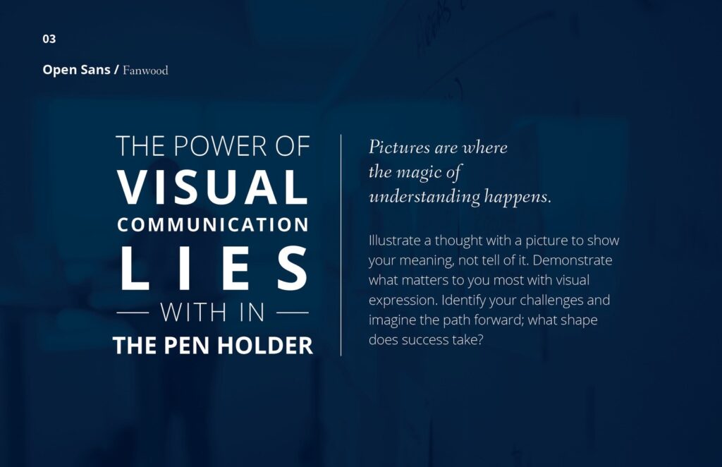
7. Open Sans
Often this smooth font is represented as simple, modernist, and highly accessible. While this is a secure choice as a modern website font, its performance and quality management appears to function best for companies with their highest values.
8. Lato
This sans-serif popular website font has been specifically designed for business purposes and therefore appears to fit ideally for companies on this traditional side. It is very authentic, but also friendly and welcoming.
9. BEBAS NEUE
This all-caps, serifless professional website font is ideally suited for typing out headers. Like Dosis, the style and design are subtly modern and complements technology labels. It typically fits other fonts such as Montserrat, Lato, Playfair.
10. Josefin Sans
Josefin Sans is an angular website font with a sleek and retro look, based on font patterns of the 1930s. Because of its elegant air, it is also used by luxury, fashion, and makeup brands. It covers the whole range from thin to dark font weights.

11. Abril Fatface
A typeface can’t take itself too sincerely with a title such as Abril Fatface. But let’s not judge a book by its cover here! This angled serif font, one of the best fonts to use for a website, generates warm intensity and a style that is somewhat quirky. Brands usually use this for imaginative and enjoyable purposes.
12. Quicksand
Both in the smaller cases, delicate or bold upper cases, the lively nature of Quicksand is preserved. The geometrical font of San Serif is ideally suited to friendly, young brands or advertising for kids.
13. Exo
What began as a Kickstarter venture is now one of the most popular website fonts in the world today. Exo is a geometric sans-serif font with a wide font community that makes it an advanced technology and gaming company’s flexible choice.
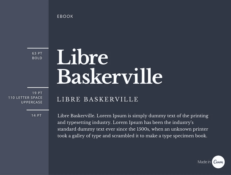
14. Libre Baskerville
Studies have shown that Libre Baskerville is considered the most credible market brand. This is why banks, finance companies, and other investment companies commonly use the serif font as a popular website font.
15. Roboto
Roboto is classified as a neo-Grotesque font – it is not futuristic, it refers to its Gothic roots. The type of sans-serif is fascinating since its angular and open shapes are also available. The effect is a font that simultaneously looks pleasant and highly competent, making it one of the best fonts for websites in 2021.
16. Times New Roman
While many artists mock Times New Roman, this iconic font is hard to compete with. The serif font is simple, comprehensible, and eternal, never out of aesthetic.
Finishing Thoughts-
This list included all the top professional fonts for websites. We hope we helped you to choose the ideal font for your business. Creating your website can be a tough task and on top of it deciding the typographies can be more to do. That’s why Glorify has got you covered. Check our website, for more such blog posts. Also, let us know about the topics which you would want us to write on in the comment section below.
Best Fonts & Typefaces for Website FAQs
1. What’s the best printing font?
Since it is easy for the user, serif fonts are chosen as technical fonts. It is commonly used for printing journals, publications, or textbooks. Serif styles are mostly suggested since they appear stylishly to make your homepage or resume more friendly, that’s why they are often favored.
2. What is the best font for the showcase?
Komoda is an exceptional, sans serif show typeface. The thin typeface adds a beautiful height and genuinely separates them from standard without serif show fonts. Try to connect it to a squatted, bold fonts and something that pops out will be produced.
3. What is meant by a script font?
Script logo fonts are both professional and informal styles with script handwriting layers and productivity. Sans-serif logo typography falls short of the “feet ” at the edges of each letterform and is regarded as more contemporary than their serif equivalents.


Features
Explore templates
Alternatives


© 2024 Glorify App - All rights reserved