

Discover the essence of Amazon Storefront banners and their pivotal role in captivating potential customers. Learn the optimal size – 3000 pixels wide by 600 pixels tall – for seamless integration and stunning visual impact. Uncover expert tips for crafting compelling banners that reflect your brand identity and drive sales
Posted Jan 25, 2023
•
6 min read

Design, Graphic design

Create beautiful marketing graphics at scale.
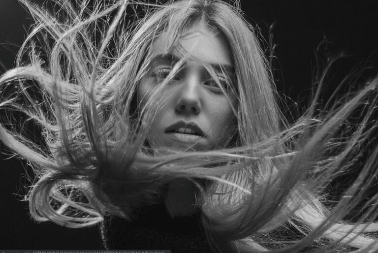
Monochrome Design Trend 2023
This technique is usually used to create a very well balanced and coordinated look between the delivering message or content and the design. As it’s a very simple looking but chic coloring pattern, it doesn’t shift the attention from the main content to the design. This technique helps in giving a very aesthetic and professional look with an important message or content as a highlight.
Here are given some of the most appealing uses of the monochromatic coloring scheme and also Glorify is helping you out with some tips and templates for designing anything you wish, using this coloring technique.
Why Is Monochrome Trending?
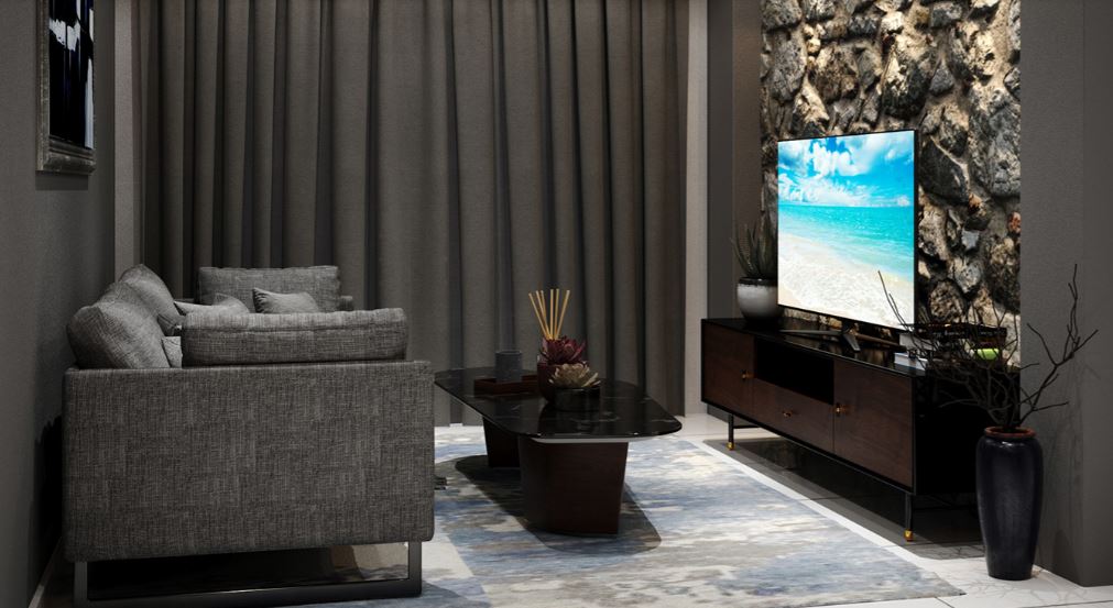
At Glorify, we’ve seen black, white and grey are the top 10 color-related search terms over the last 12 months. This methodology of using different tones of the same color has been very alluring for the designers and their clients as well. People are tending towards this coloring palette as it has a slight hint of colors and the minimalistic look is more which is very visually attractive and edgy. The monochrome trend is mostly adapted by interior designers and digital developers as it gives a cohesive and professional look to the simplest of things.
Whether it’s fashion or technology, the monochromatic coloring pattern is being extensively used and is also becoming widely popular.
The reason for the monochrome trend’s popularity is that this technique is very effortless to do. The designers have to stick to one color only when selecting the tones and this leads to zero confusion as they don’t have to choose from a wide range of hues. From start-ups to global companies everyone wants their brand logo to look extremely professional, to the context, and stylish. Well, you can achieve all of these cool attributes under one roof now.
Off late, one can see the artists and designers are being very experimental with their work. This makes them think out of the box and marooning from the simple white and black designs rather than we can see that everyone is following the duotone trend. Even using the right color palette and experimenting with bolder colors can just uplift your design up to a thousand times more. We don’t need to step away from the monochromatic technique’s timeless approach, we just need to add a bit more perspective to these ideas spired by the duotone trend, artists and designers are taking a fresh approach to the timeless monochromatic palette, by stepping away from simple black and white designs and instead concentrating on bolder colors.
Designers or interior stylists make very congruous patterns whilst still keeping the diversity of the foundation styles. Instagram can be the quintessence of the monochrome trend. At least one person on your Instagram list most likely would already have a very well-curated and appealing monochromatic Instagram feed.
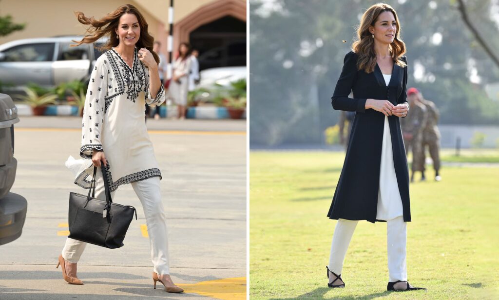
From the British royals Kate Middleton and Meghan Markle to fashion celebrities like Kendell Jenner or Selena Gomez, this monochromatic trend has taken all over the design and fashion world. These notorieties have pulled-off some great and chic monotone hues outfits and created an amazing statement.
Designing with a Monochrome Colour Palette
Can’t decide where and how to fuse your designs with the monochromatic techniques to make it look chicer and more extravagant?

Well, you don’t need to worry. We at Glorify have you got covered. Below are some tips to help you start with a monochromatic design.
1. Keep It Simple
Simplicity is the key to get a chicer and reprehensible design. While starting out, one might get overwhelmed and use too many hue variations but you need to strictly avoid that as it won’t make your design look coordinated and if a lot of elements would get incorporated, it would make it look out of joint and we are strictly shrugging off these kinds of features from our desired look.
Using only that number of colors that one needs is systematic while applying the monochrome trend to your designs. For example- one base color for the background and then building the other hues accordingly, like one for text and the other for design. This pattern can give an edgy look to your illustrations. Increasing and decreasing hues seamlessly throughout your design can make it look cohesive, pricey, and most importantly effortless.
2. Add Contrasting Tone
Creating a statement by using two absolutely contrasting monochromatic palettes can make your design stand-out. This method can perform very efficiently if one has two correlated designs but different product labels for the same brand. Using contrasting tones can give individuality to each of the designs but also make it look coordinated. Thus, one can use two monochromatic color ranges for different products of the same brand.

3. Explore Colour Overlays
As the name suggests, when a color is laid over an existing color that is known as color overlay. The opacity of the foundation color depends upon your choice. Now rather than using blocked colors one can use monochromatic color overlays on their designs or prints. The different tones of colors peek through each other and it makes it seem as if there is some gradation of hues happening. Overlays create a very bold and unique statement if used wisely. Color overlays can be used in graphics as well as fashion series. The coalition of monochromatic tones with overlaying creates very artsy and aesthetic patterns.

Are you ready to get designing some chic black and white designs to own the monochrome trend? Do not forget to use the super user-friendly, e-commerce business-oriented templates at Glorify today!


Features
Explore templates
Alternatives


© 2024 Glorify App - All rights reserved