

Discover the essence of Amazon Storefront banners and their pivotal role in captivating potential customers. Learn the optimal size – 3000 pixels wide by 600 pixels tall – for seamless integration and stunning visual impact. Uncover expert tips for crafting compelling banners that reflect your brand identity and drive sales
Posted Jan 25, 2023
•
6 min read

Graphic design, Social media, Facebook

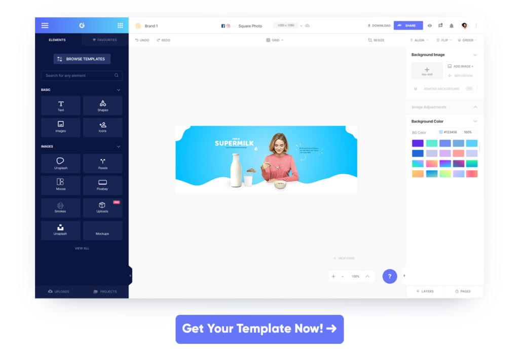
Create beautiful marketing graphics at scale.
Ideal Facebook Cover Photo size and Best Practices 2023
Not only does a business Facebook page’s cover photo look branded, but it should also be in the optimal and recommended Facebook cover photo size to speak a language of persuasion and that cannot be if it is not high-quality and perfectly optimized for display.
Dimensions matter and they are there for a reason!
Why do social media websites and apps like Facebook, Twitter, etc. demand that you upload an image of a specific dimension, including the Facebook cover photo size? Well, it has to do a lot with the bizarre number and type of e-devices that are used to access them. The different configurations of these devices essentially translate to the need for adhering to the designated dimensions that these social media platforms demand.
As far as Facebook is concerned your Facebook cover photo size should be 820×312 pixels on a regular desktop and 640×360 pixels on smartphones.
However, if you thought that simply by sticking to the standards you are saved, then you are wrong. There are several potholes in these systems that make life a living hell for several business owners who try to make Facebook a decent source of customers.
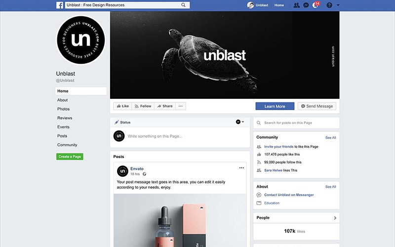
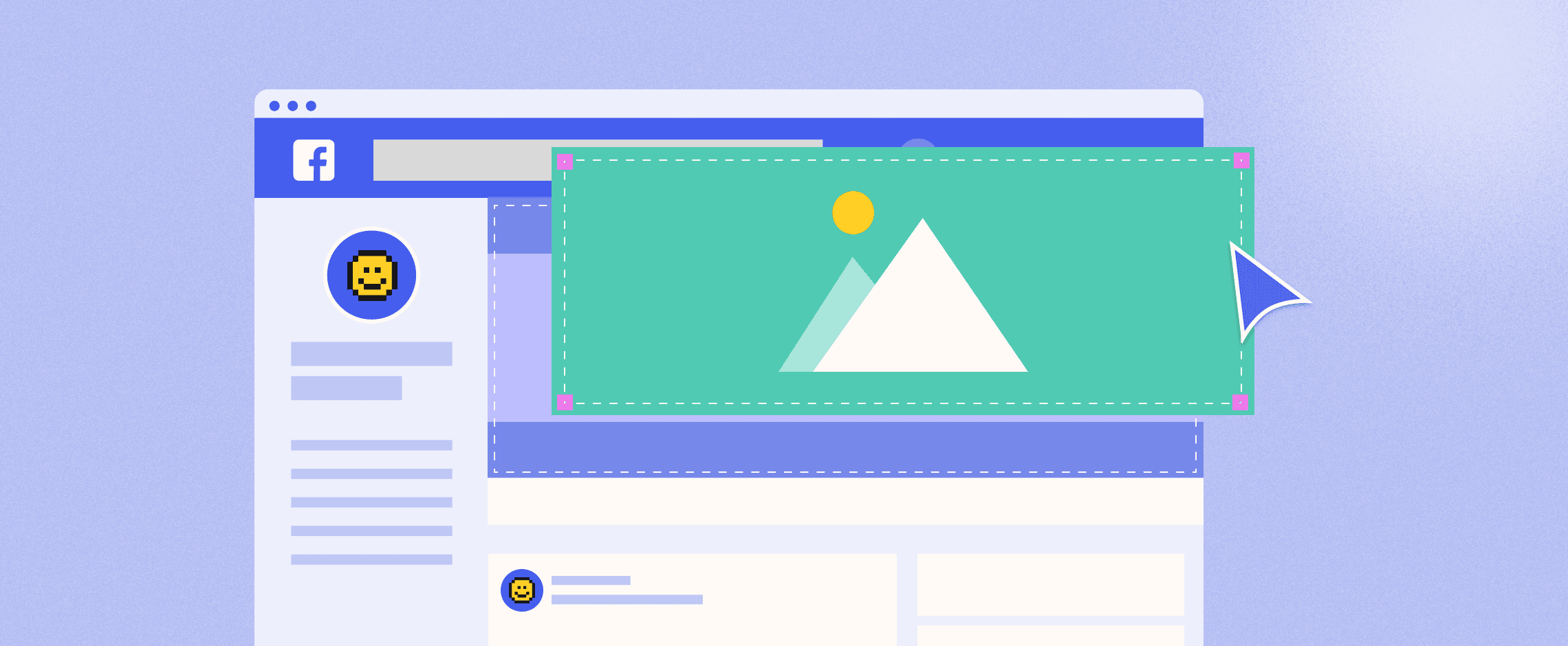
In the image below what we have done is that we have created a designated safe zone where your content will at no cost be cropped, chopped, masked, trimmed, or whatever that relates. And it is important that you stick to this particular style if you wish to keep your visual content as engaging as possible.
Facebook cover photo size : Desktop vs Smartphones! A critical Analysis
The safe zone is a vital place for keeping your visual content from getting masked. As the devices differ, the display interface differs as well, what that translates to is, a skewed, or stretched image in case of most social media platforms, but thankfully not for Facebook.
In the case of a smartphone, Facebook will crop out or mask your cover’s sides while on a desktop or laptop, it is the top and bottom that receive the knife.
The usual mistakes around Facebook cover photo size that need to go to the bin!
No matter how many images you choose for your Facebook cover, there are some important things that are not to be forgotten or bypassed.
They include the following;
Avoid using the same cover photo
Avoid too much of text
Do not clutter your cover
Always follow the recommended Facebook cover photo size
Do not always choose something generic
Never forget to brand your page and your cover
Keep in mind these important things and you have covered a lot of ground already.
Inspiration!
We are making a list of some super awesome role models that you can follow while making your cover for Facebook.
1. Drip:
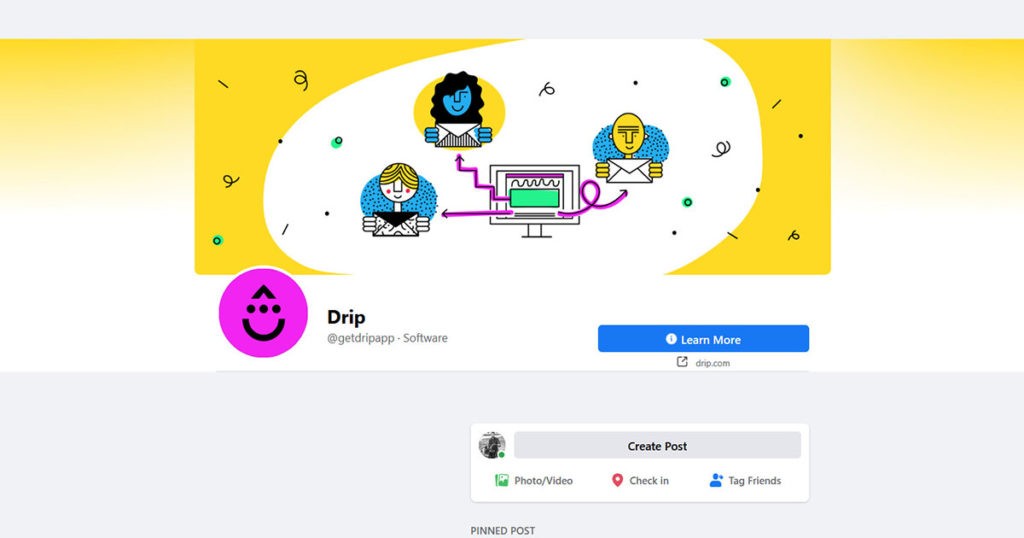
The most attractive thing that we can find about drip is the simplicity they have resonated throughout their cover page and how it aligns directly with their product. They have ideally used the area designated for cover page to demonstrate how easy it is to use their product. Such brilliance is rarely found.
With their layout and design, they have effectively converted their cover page into a lead generator.
2. Buffer:
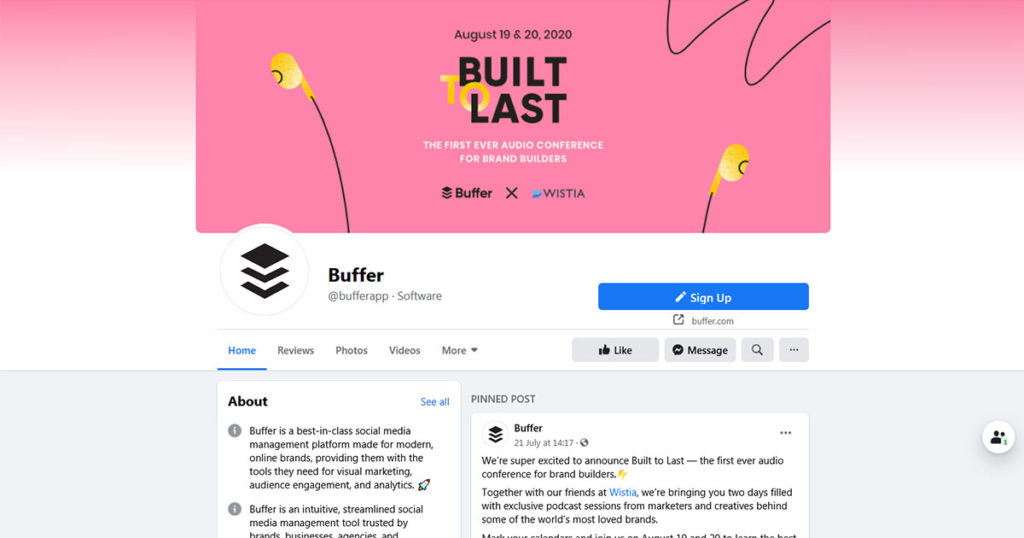
This is yet another example of the fact that you can turn a cover page into a lead generator. Buffer has also gone with simplicity and effectiveness.
The key takeaway from analyzing Buffer’s cover page is “keep things simple”.
3. Tamara Knight Photography:
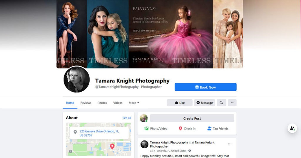
This FB page’s cover is an outstanding display of careful use of clever imagery and branding. The choice of a family photo invokes in its customers an emotional appeal. What that translates to is the need for you to address the emotional quotient of your customers.
Also with a very faint watermarking representing all of the textual elements this cover has an elite look to it.
4. Bar Method Winter Park:
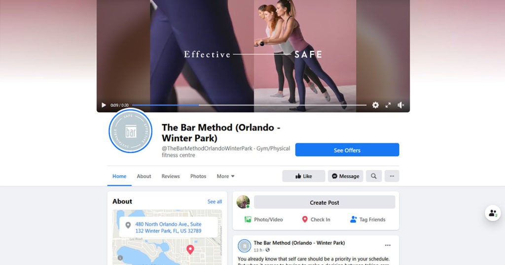
Strong lighting, light colors, smart use of textual elements all transform to a highly converting cover page in the case of Bar Method Winter Park.
The motivational text is visually very dynamic and features their branded hashtag, remember that hashtags are a thing now.
So all of this translates to the importance that your FB cover deserves. Do not let awesome opportunities pass by just because you were too afraid or lazy to be creative. It is time that you take a fresher perspective on your business and bring your team to the drawing board.
Now, how can I do all of this!
It is sad to have great artistic skills and no proper tool to put it into work. It is here that we bring it to you, Glorify! Yes, so far we have been ranting about the best FB cover pages and how they are all making big bucks for their makers.
This is no longer a dream for you, the artist and entrepreneur inside you need to collaborate and you need a great platform to do so.
Well, look no further as you have got Glorify to back you up. What Glorify does for you is cut short all the hassles of the clinical precision that you need to follow when it comes to making great FB covers. Remember our “safe zone” well GlorifyApp have several built-in templates that you can choose according to your artistic taste and what seems fit to your business.
Additionally, this awesome tool comes with a “no card required” free trial and a whole free plan as well.
FaceBook Cover Photo-FAQs
1) How do I make FB cover images?
If you want to add a new image as your FB cover, select edit cover photo by clicking on your profile picture. Then select add cover photo.
2) Why is my FB cover photo so blurry?
The standard dimensions of Facebook cover images if not met, Facebook will stretch the image and it will get blurred. So make sure that you upload an image that abides to the recommended Facebook cover photo size of at least 820 pixels wide and 312 pixels tall
3) Why is my image displayed with such low quality?
Make sure that you have met the size constraints. Also, FB often compresses images before upload. You have to make additional settings to counter this. For ease of use we suggest using a third party template provider like Glorify.
4) How can I add a vintage touch to my cover photo?
You can fiddle around all day with image editors to give your photo that vintage look you desire. Or you can directly edit your image using apps like Glorify and use a vintage filter. This saves you a lot of time and effort.
5) Are third party editing tools worth the investment?
Truly they are! Maybe you can edit better than any tool out there but the time you get saved by using apps like Glorify can be put to good use by a creative entrepreneur like you.


Features
Explore templates
Alternatives


© 2024 Glorify App - All rights reserved