Discover the essence of Amazon Storefront banners and their pivotal role in captivating potential customers. Learn the optimal size – 3000 pixels wide by 600 pixels tall – for seamless integration and stunning visual impact. Uncover expert tips for crafting compelling banners that reflect your brand identity and drive sales
Posted Nov 9, 2022
•
6 min read

Design, Graphic Design

Create beautiful marketing graphics at scale.
Gradient Logo Design: The Dos and Don'ts of Designing Gradient Logos [The Complete Guide]
But don't worry, you can still create a gradient logo if you keep a few things in mind. Before we dive into the dos and don'ts of gradient logo design, let's get the basics straight.
What are gradients and when can you use gradient logos?
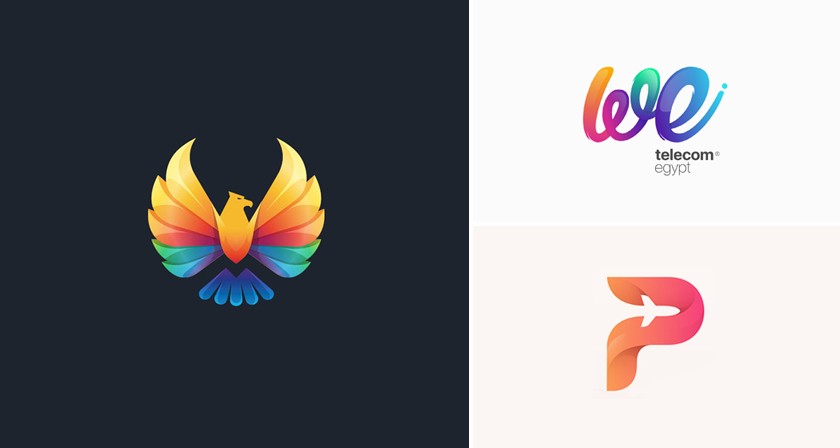
A gradient is a color pattern obtained by blending two or more colors. The result is an aesthetic mix that is different from the conventional color wheel. Stacking colors side by side does NOT result in a gradient; they simply give you a rainbow effect.
There are two ways you can use to get gradients. The first way is by blending different shades of the same color. The second way is by blending different colors so that they bleed into each other. In technical terms, gradients are also known as color progressions or color ramps.
Logos that sport gradient colors are a great way to make your brand noticeable. However, making this decision on a whim isn't the wisest thing to do. Here's when using a gradient logo is a good idea:
1. Your business is in the creative industry
Gradient logos will not suit every business, and you need to carefully analyse the effect it could have on your brand. For instance, if you own a dispensary or pharmacy, a gradient logo will contradict the serious tone of your brand voice. But if you own an art shop or a party planning business, a fun, colorful logo will be perfect and appeal to your target audience!
2. Your business is online
If most of your marketing is done on the internet via websites, social media and emails, a gradient logo is a good option. Printing gradients can be problematic since they consist of multiple colors. If you own a stationery store, it's better to go with a flat logo color scheme since you will have to print your logo on all products. On the other hand, owning an e commerce store is a good reason to have a gradient logo.
3. Your logo contains an icon or symbol
Adding gradients to text based logos is most often a big NO. The words in your logo need to be clear and legible. Adding a gradient to the text will draw attention away from the words and defeat the purpose of a text based logo. It's always better to incorporate gradients into the icons, images or backdrop.
Gradient logos have gained popularity over the years with some of the most iconic logos such as Instagram and Firefox falling into this category. Glorify has put together some useful tips on what to do and avoid in gradient logo design.
Do: Create a non-gradient foundation for your logo first
Diving headlong into gradients isn't the best idea. Take it slow and create a basic design with flat colors first. This will give you an idea of what your logo will look like without gradients. You can then start experimenting with colors to find out the ideal look for your brand. The basic version of your logo can also come in handy and be used on items like letter pads, brand clothes and more.

Don’t: Add gradients at the initial stage of design

Follow the pattern of incorporating a few elements at a time. Rushing the design process leaves room for mistakes and poor choices. Adding gradients and elements in the initial stage of the logo creation can make your logo look super chaotic and busy, which is definitely not the look we're going for.
Do: Use a brand-appropriate color scheme
Make sure the colors and pattern chosen for your gradient can be easily connected to your brand. It has to be relevant to your company and make viewers instantly think of your business. Remember, it is not compulsory to use gradients. If you aren't satisfied with a color scheme, discard that idea and explore more options.

Don’t: Add elements irrelevant to your brand

Using a lot of creative edges, contrast, and depth may look eye-catching but always ask yourself this question: Does the design given any context of my brand? If the elements of your logo do not match your brand messaging, your business will come across as unprofessional. Always make sure your audience find your logo relatable.
Do: Use soft gradients and a minimalistic look
Take a look at any popular brand that has a gradient logo. They all have one thing in common: a subtle gradient pattern. Subtle gradients add an extra oomph to your logo design and give it a classy and professional vibe.
Always remember to use the gradient pattern discreetly at first and then intensify it accordingly. This is a great hack if you want to get the same design in the print. You will be able to do so in high-quality without distorting the design.

Don’t: Use chunky gradients with intense colors

Everyone wants their logo to turn heads. Just make sure it's not for the wrong reasons. Intense colors and contrasting gradients may sound like a good idea, but they will only make your logo look tacky, unprofessional and tasteless.
Do: Design and layer gradients in a professional manner
When designing gradient logos for yourself or outsourcing it to any third-party client, always remember to make it look professional rather than chaotic or amateur. It should fit the client's requirements and elements should not be added for the sake of filling in empty space. Every angle and viewpoint of your gradient logo should be carefully designed and serve a purpose.

Don’t: Use unnecessary gradients

The blending of colors should look effortless and smooth. Always remember to modify your gradient logo in a pattern that is in some way relevant to the foundation logo and your brand. No part of your logo should be irrelevant. Avoid using gradient styles for the sake of it.
Do: Design print-friendly gradient patterns
Gradient logo design is a bit more complex in comparison to flat or monochromatic logos. The quality of your gradient logo should be high enough to ensure that the printed version of it is clear and sharp as well. It is important to aim for high quality from the start.

Don’t: Ignore the aspect of print
If your logo doesn't work with print, you might face some issues down the line. Changing your logo will be damaging to your business and using a distorted logo will also drive customers away.
The best examples of gradient logos
Gradient logos have been around for quite a while. Most of the time, we simply don't recognize them for what they are. Take a look at some globally recognized gradient logos.
1. Instagram

This vibrant logo is seen by millions of people every day. The playful gradient colors are perfectly suited to this fun, aesthetic app.
2. Jaguar

This silver and metallic gray logo perfectly reflects the powerful, majestic vibe of this million dollar automobile company.
3. Asana

Asana uses gradients to add an aesthetic touch to their otherwise simple logo.
4. Mazda

Mazda's timeless logo suits all backgrounds and mediums, whether digital or print. The metallic gradients give it a classy and elegant look.
5. Firefox

The warm gradient colors of this logo perfectly complement the brand name. It also perfectly syncs with the fox icon that makes up the name and logo.
How to create gradient logos using Glorify
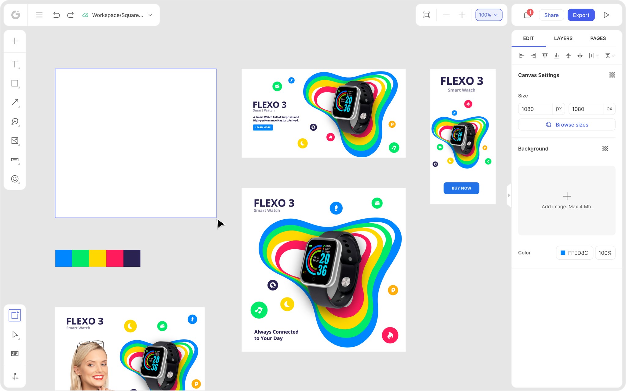
Glorify's logo maker is effective, efficient and super easy to use. It's perfect for creating your own professional logo without the cost of outsourcing. The question is, can you add gradients?
Absolutely! Once you’ve finished designing your logo with Glorify, follow the steps below to add a gradient to your design.
Step 1: Select the shape or tagline of your logo.

Step 2: Click the text or shape settings in the edit panel on the right side of the editor.

Step 3: Click the gradient toggle found in the color palette.

Step 4: Click on either of the buttons on the slider below the gradient toggle to add the colors of your choice.

Final thoughts
Gradients can do wonders to your logo. But using them wrongly can be a disaster. Make sure that the color palette, intensity and gradient pattern resonate with your brand and industry and appeal to your target audience.
You don't have to be a designer to create gradient logos. With Glorify, you can easily create your own gradient logo and add icons, images and backgrounds within minutes. You also have access to thousands of logo templates that can be customized to suit your brand.
Create your gradient logo today!
The dos and don’ts of designing gradient logos - FAQs
1. Can the readability of a logo can be affected by a gradient?
This can only happen if gradients are used wrongly. Avoid using intense, contrasting colors that overshadow the basic design and text. Instead, use subtle colors that highlight the main elements of your logo.
2. How can I create a gradient logo?
Glorify's logo maker is the ideal tool for both beginners and professionals to create a logo within minutes. The simple editor tools provides the easiest way to add and control gradients in your design. You can also choose from among 1000+ templates that can be customized with the icons and images of your choice.
3. Can the gradient logo be transformed back into the basic black and white design?
Yes, it is possible to convert gradient logos into monochromatic designs. Almost in every industry, at a certain level, your logo will need to be recreated in black and white depending on the campaigns, marketing strategies, etc. When converting your logo into black and white, make sure the gradient areas do not disappear or become a grey smudge.
4. Are gradients a good design?
Gradients can work wonders for your logo and definitely make your brand stand out. However, you need to make sure that the gradient design suits your brand and is relevant to your target audience. If your logo looks more professional with non-gradient colors, avoid adding gradients simply for the aesthetic touch.
5. Can gradient logos be printed?
Printing gradient logos can be tricky and result in an unwanted banding effect. If your business requires the logo to be printed often, it is best to go with a non-gradient design.
6. What does a gradient represent in design?
A gradient is a color pattern obtained by blending two or more colors. The result is an aesthetic mix that is different from the conventional color wheel. Gradients can be obtained by blending different colors or different shades of the same color. They are also known as color progressions or color ramps.
Features
Explore templates
Alternatives
© 2024 Glorify App - All rights reserved


