

The Shopify Hero Banner is a design format used to create visually striking and attention-grabbing banners on Shopify websites.
Posted Nov 9, 2022
•
9 min read

Design, Ecommerce, Graphic Design

Create beautiful marketing graphics at scale.
10 Best Fonts For Logos: Top Recommended Fonts For a Clean and Minimalistic Logo Design
For a clean and neat logo, a minimalist and simplistic approach to typography is where one should begin. Brands in the past have proven how minimalist and simplistic logos can make a logo timeless and iconic. Look at the fonts used by Louis Vuitton, Kate Spade, Burberry, Tiffany & Co. – all these big brands (and more) have one thing in common – timeless, effortless logo typography.
With the evolution in designing, the best fonts for logo design have also evolved over time. With just a serif font in the past, we have now arrived at a huge variety of non-serif fonts available for use. Minimalism, as a concept of design, is fueled by the idea that less is more; and perhaps, more really is more. Minimal fonts could be regarded or referred to as fonts that are stripped down to expose only the essential elements- sans any unnecessary fancy strokes or embellishment.
While there could be hundreds of minimal fonts available out there, here we have come down to a quick cheat-sheet of 10 best logo fonts for a clean and minimalistic logo design–
Each font has been given a brief description and a supporting image for better clarity.
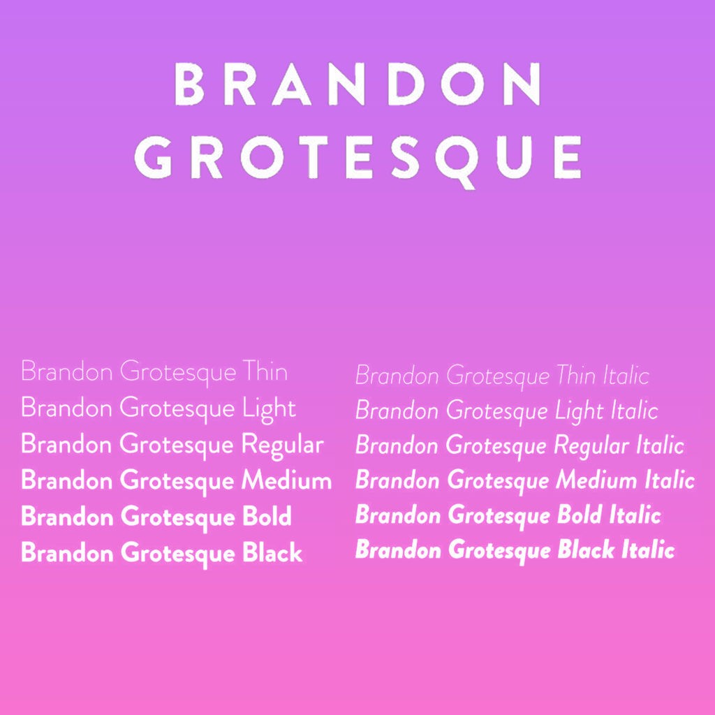
1. Brandon Grotesque
This font, while has a warm and caring touch just by the look of it, also does not compromise on functionality and utility. One of the best fonts for logo design, Brandon Grotesque is essentially a sans serif type font, from a family of six weights plus matching italics and was designed by Hannes von Döhren in 2009/10.
Essentially based on geometric forms that are optically corrected for better legibility, this professional typography font is armed to nail any logo in its complex, professional look. Brandon Grotesque also does wonders for contemporary brands and their logos.
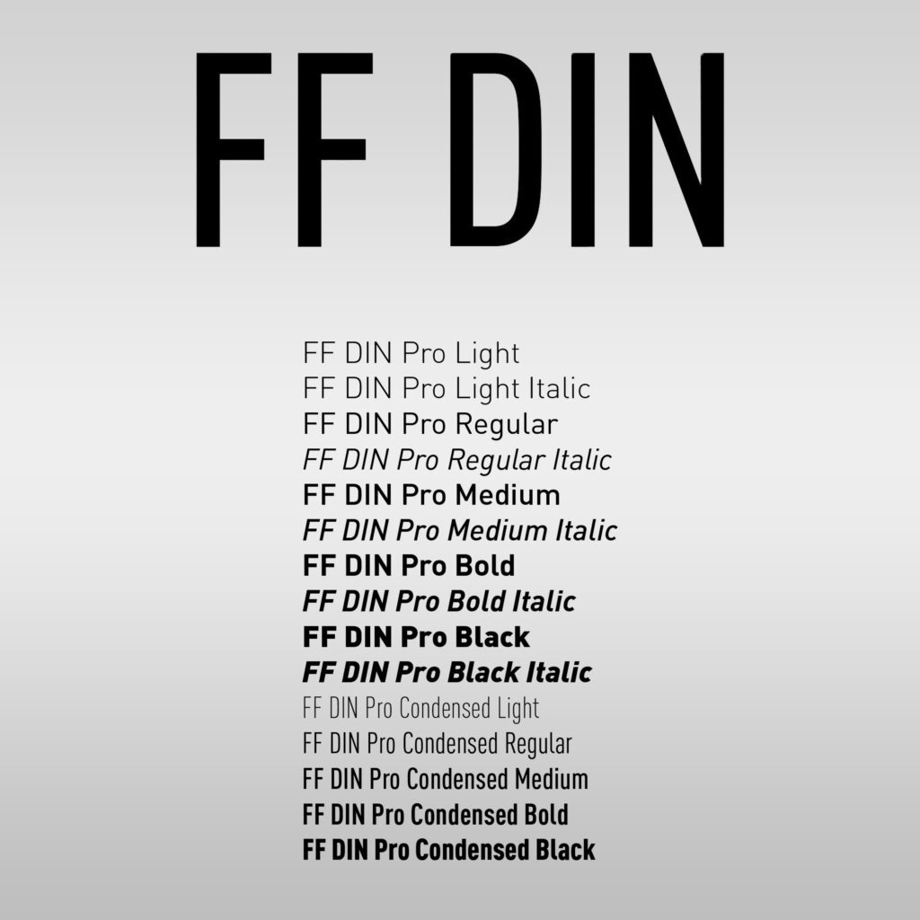
2. FF DIN®
The FF Din font family has a total of 20 weights with a rounded font version and it all ranges from light to black in normal and condensed styles (also including italics). You can also avail some advanced typographical support with FF DIN. The font features some really useful features such as case-sensitive forms, fractions, super- and subscript characters, and stylistic alternates.
Ideal for logo and brand identity designs, using FF Din for your logo can really move your brand to great brand recognition and awareness in general.
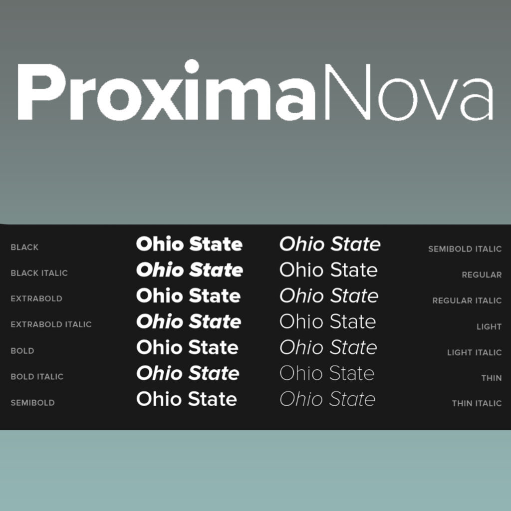
3. Proxima Nova
While FF Din offers some 20 weights, Proxima Nova leaves you by surprise, outweighing FF Din with its 48 styles! The Proxima Nova family is an overhaul of Proxima Sans (1994) in which the original six fonts have been expanded to 48 fonts. This family offers three widths: Proxima Nova, Proxima Nova Condensed, and Proxima Nova Extra Condensed. Each of the widths further offers 16 fonts each – seven weights with matching italics.
Proxima Nova can be looked at as the bridge between typefaces like Futura and classic sans faces. The hybrid by-product combines the perfect elements of humanistic proportions in a geometric appearance.
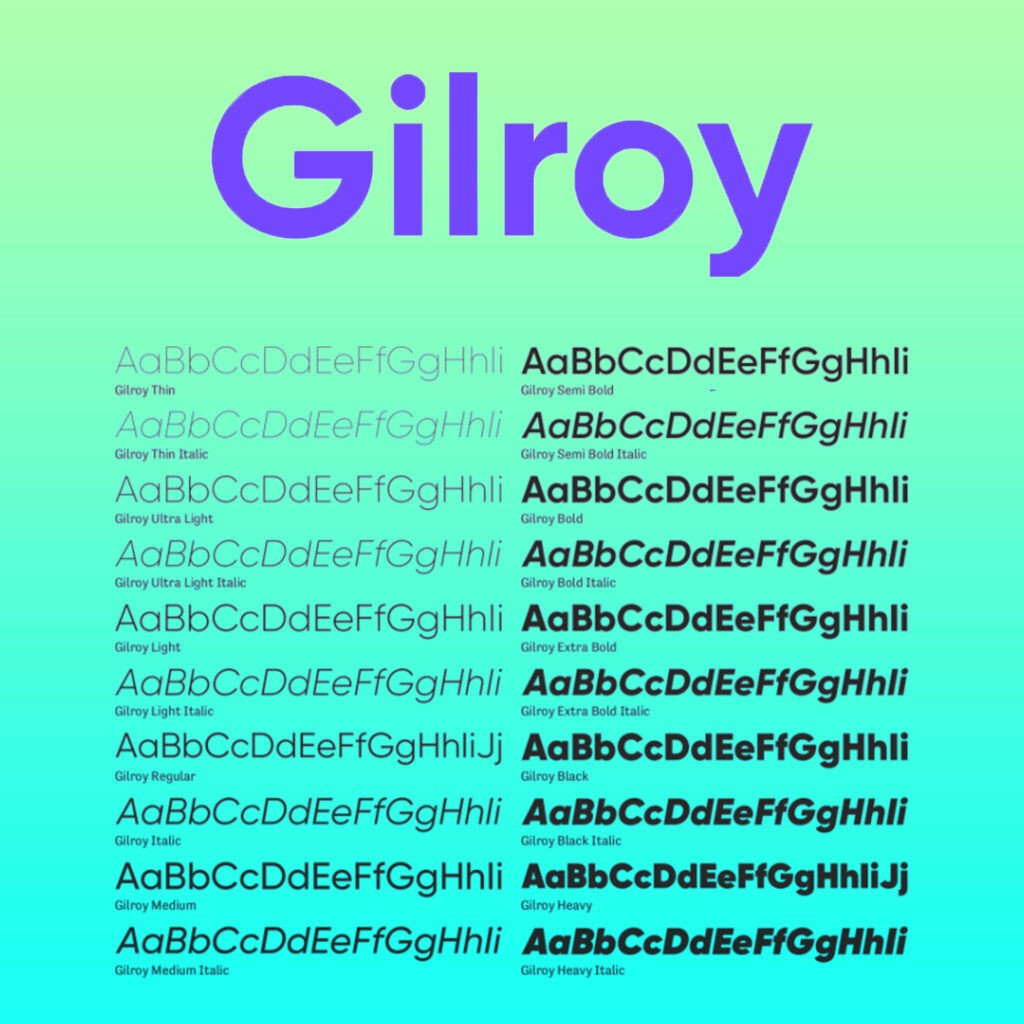
4. Gilroy™
Speaking of the best fonts for logos, Gilroy is simple to understand. It is your modern sans serif, however, with a geometric touch and looks to it. Gilroy is equipped with 20 weights, 10 uprights, and its matching italics. The geometric, clean, and neat font comes with light as well as extra bold weights that are free to use, making it a perfect match for graphic designs of brands. Gilroy works wonders for use over the web, for signage, and for building an overall corporate identity in the long run.
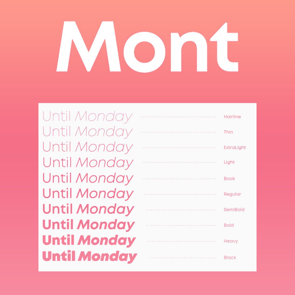
5. Mont™
Mont, also, is a geometric-looking sans serif but it consists of ten weights. Mont ranges from hairline to black with matching italics and also supports extended Latin, Cyrillic, and Greek — more than 130 languages all together.
Some unique features and characteristics that Mont, as one of the best fonts for logos, offers include its pointed “t” and the prominent x-height. These features, also, particularly make Mont a great font for expressive headlines, for long texts, and for phenomenal logos.
Mont encompasses a huge range of OpenType features like tabular figures and advanced typographic features like ligatures, fractions, case-sensitive forms, superscripts, subscripts amongst others. Mont’s typeface and the options to experiment with its versatility make it a go-to font for any graphic designer’s block.
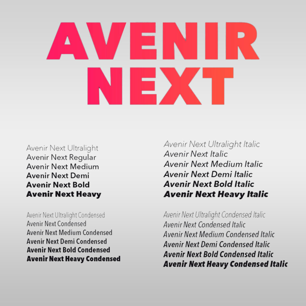
6. Avenir Next®
Avenir Next is the result of beautifully designed and updated sans. The update, however, has only been undertaken in a way that does not compromise with its technical standards; only to yield a superior sans family.
Though an update, Avenir Next cannot be boiled down to only an ‘update.’ It is the expansion of the basic concept taken to the next level. Apart from the standard styles ranging from ultra-light to heavy, Avenir Next is a 32-font collection that also offers condensed faces arguably better than any other sans family out there. In an overall neat and really, really clean look, Avenir Next also pairs very well with serif body types by virtue of its heavyweights – the magic recipe for branding designs like logos.
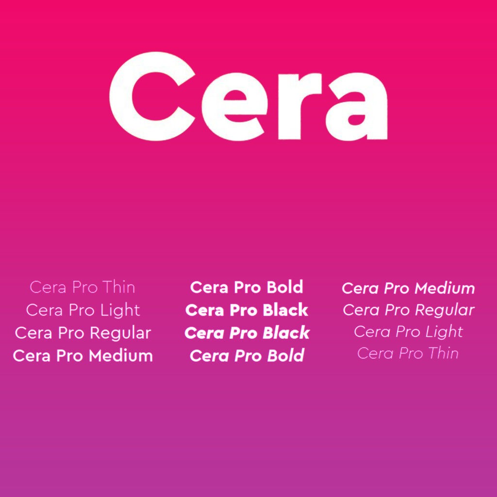
7. Cera Pro™
Cera Pro font is a baby of geometry infused with simplicity and minimalism. The Cera family encompasses in its family not only the best-selling font for logos and most-liked Cera Pro, but also the stenciled counterpart Cera Stencil, Cera Brush, and Cera Round Pro.
Cera Font is equipped with six weights, a 10 degree slanted clean italic, dingbats, and arrows. The font has been a go-to for designers in pursuit of a font that gives clean headlines in print and on-screen even in other multiple languages. Because of its geometry, this font makes a great choice in terms of creating a lasting impact on logotypes. For the best part still- Cera is over 980 glyphs per weight but Cera doesn’t ignore localized letterforms and has the OpenType features to match.
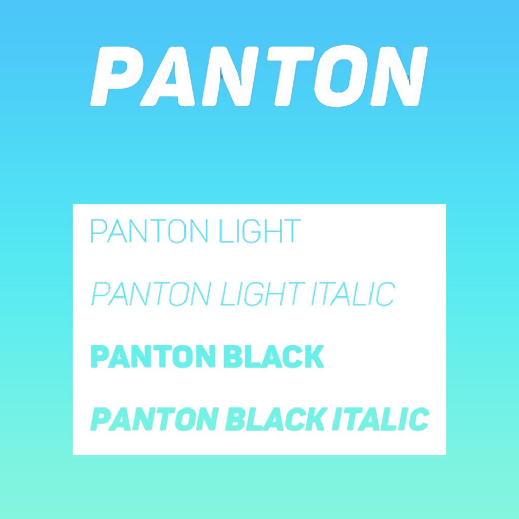
8. Panton
Panton stands out for its legibility on the web as well as on print designs. The family includes a total of 36 weights – 10 uprights with 10 italics and 16 icon sets. Panton could be categorized as an inspiration from the classic grotesque typeface. Panton, also, is a geometric-looking font, however, it expresses itself in softened geometric forms.
Panton makes an excellent choice for geometric designs, optimized kerning, and obviously, is a viable font for logos. The Panton family is also major when it comes to headlines of all sizes and text blocks in both maximum and minimum variations. Panton is not uncommon on the web, print, fabrics, and even posters – all the way more justifying its credibility as a logo font.
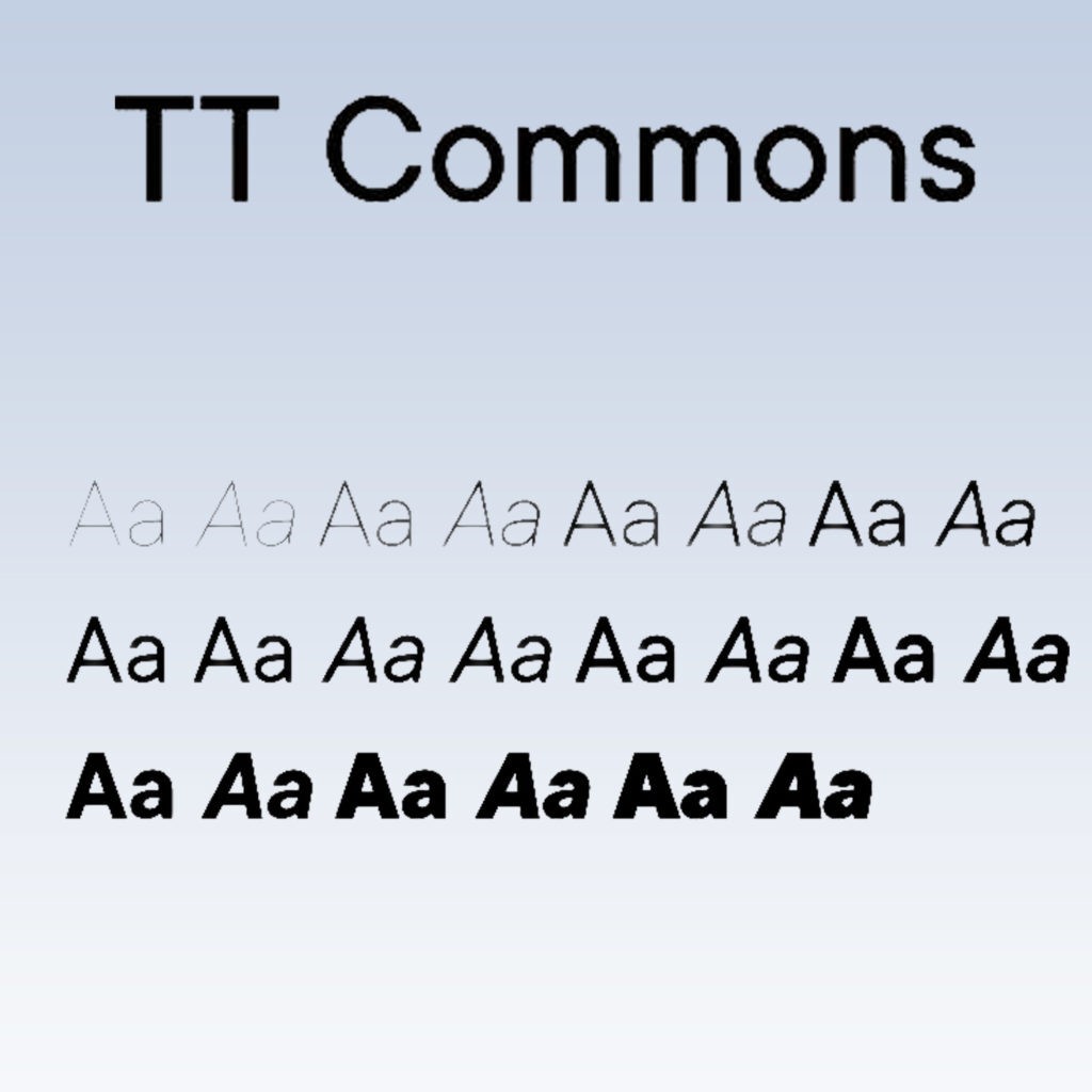
9. TT Commons
A universal sans serif font, TT commons as another popular, best font for logos features minimum contrast of strokes, has a closed aperture, and geometric shapes of characters. TT commons originated from the TypeType logo that surfaced in the design world around 2016 as a part of the rebranding of a project. The TT Commons typeface seems to have been developed to take care of almost any task that requires a corporate font to suit its looks.
TT Commons can be your ideal pick for the branding of your company and logo as its low contrast strokes and averaged drawing of letters make a great match. The typeface design of TT Commons though not designed to look decorative and embellished, it manages to please the appeal and aesthetics with its simplicity and sharpness of forms. TT Commons typeface can make a great display font for your brand!
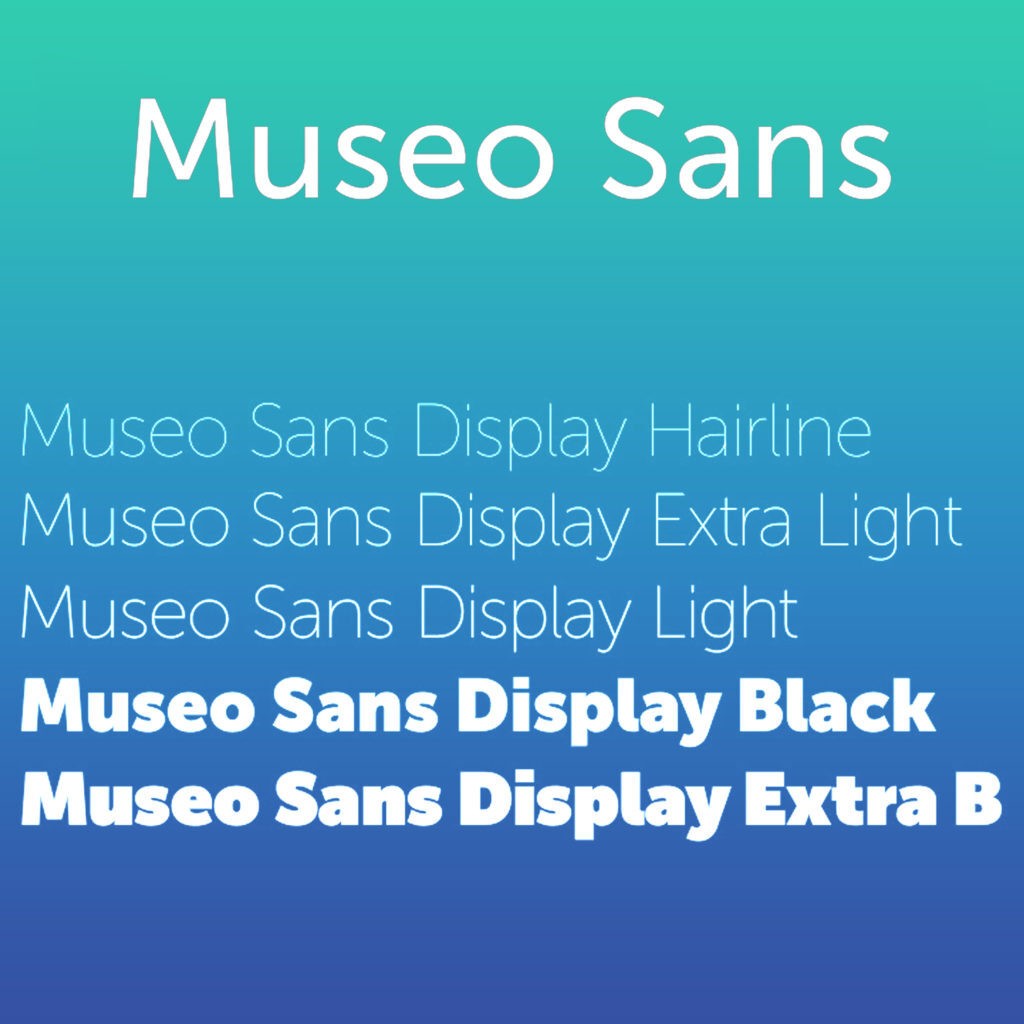
10. Museo Sans™
Based on the otherwise famous Museo, Museo Sans is an essentially sturdy, low contrast, geometric and viable sans serif typeface, suited for both display and text use. Designed by Jos Buivenga, Museo Sans actually earned Jos an identity for its extraordinarily minimalist look and feel when used as a trademark design. The Museo Sans OpenType font family even offers support for CE languages and Esperanto.
The Museo Sans font family comes in 10 fonts: 5 weights of 100, 300, 500, 700, 900; with each an italic.
Final Thoughts-
Still, struggling with creating the best logo for your e-commerce business that can build you a brand identity? Let Glorify be your helping hand and ease your worry. With Glorify’s logo maker tool, you can generate the most phenomenal and eye-grabbing logo in minutes. DIY your logo design needs with the e-commerce centric design templates on Glorify!


Features
Explore templates
Alternatives


© 2024 Glorify App - All rights reserved